Encouraging structured spontaneity and exploration for gen-z users through custom maps.
Proxi is a Seattle-based start-up that enables users to create and engage with custom, curated maps.
The idea for this company was born from the CEO’s desire to consolidate participating trick-or-treating homes and routes in her neighborhood for a festive Halloween night with her young children after the map that she made went viral.
As Proxi evolves, the company strives to center user experiences based in local and personalized navigation. My team of four was onboarded to further this mission by translating their existing web solution into a mobile app.
My role as a product designer began in a team of four designers and researchers working to complete our 6 month end-of-degree Capstone project and concluded as a freelancer for Proxi, hired for an additional 3 months to independently refine my team’s work.
Develop a personal, actionable, & useful mobile iOS app
that enables gen-z users to engage with Proxi’s maps?
Useful
Incorporating collaborative trip planning
and visual map layering.
Actionable
Providing rating capabilities for users to gauge a destination’s atmosphere.
Personal
Prioritizing a social experience that
promotes engagement with friends.
Our research prioritized the end user’s map-viewing experience to fill in the gaps from Proxi’s existing research on the map-making feature. Usability testing provided us insight into consumers’ reactions and pain points as they interact with a Proxi map. We recruited and conducted testing with four users via Usertesting.com. The test prompted users to navigate Proxi by referencing the following scenarios: (1) explore and complete tasks on the website for Seattle Restaurant Week, which features a Proxi map and (2) complete tasks regarding Proxi’s featured maps section on their website.
After coding and analyzing our usability testing data, we synthesized three key observations:
-
Users find photos and price the most important factors when making decisions on locations to visit. 3 of 4 participants explicitly mentioned photos being the primary factor in what motivated them to choose a location.
-
When we asked participants what they would change about their map-viewing experience, two of them said that they wished there was a way to view individual point information without having to click into each one.
-
During testing, 3 participants wished Proxi maps had a search feature but did not engage with the existing search button.
Five participatory design sessions enabled us to focus on Gen-Z users who reference social media to plan trips. Since the sessions required in-person participation, we recruited students aged 19-23 from our personal networks for convenience. The research objectives were to better understand our user group and uncover pain points in the travel process through the questions: (1) How do we motivate people to travel to a location? (2) What should the map viewing process look like? (3) How do we track when people have visited a location?
Our participatory design research yielded the following observations:
-
60% of participants wanted to see where their friends went when designing the personalized suggestions screen. P3 said “I’d take a one-liner about a place over a whole page of information.”
-
Users remarked: “Can’t trust reviews sometimes so vibes would be helpful” and “Filtering by vibes would be really useful.”
-
P1 said “blogs might be sponsored.. What are their motivations for recommending a place?” and P5 said “I don’t care where they [influencers] go.”
Our information architecture prioritizes four main features: explore, trips, saved, and badges.
These features adhere to our ideation goals to create a personal, useful, and actionable application. The explore tab enables structured and actionable spontaneity, trips planning is a useful and social feature for users to visualize and actualize intended trips, and badges both gamifies action and promotes crowd-sourced data collection for locations.
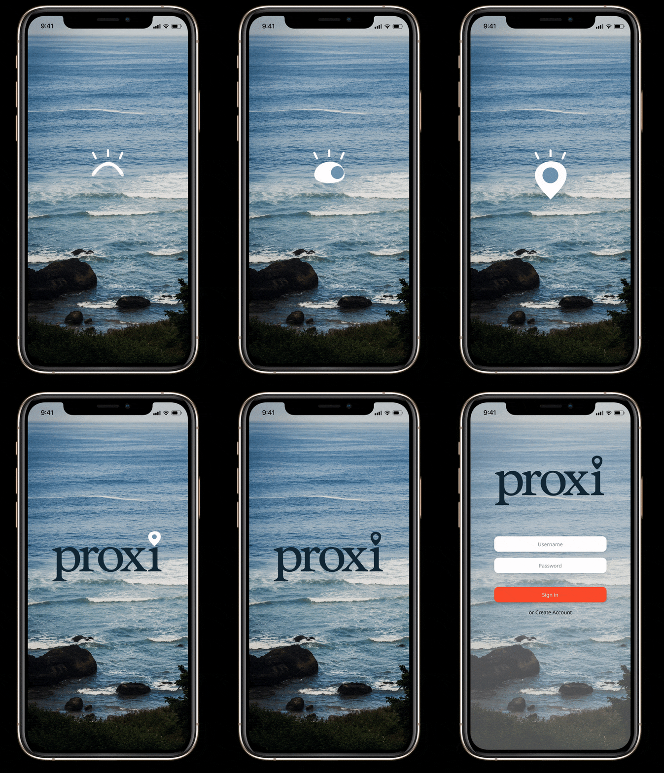
I had primary ownership over the badges flow as well as the log-in experience. These interactions especially showcase my dedication to intuitive designs and joyful animations. My teammates and I contributed to each other’s assigned flows to iterate on pain points identified during final usability testing.
-
One of Proxi’s main goals is to act as a medium for “structured wandering.” The home page reflects this goal by enabling users to discover places in their vicinity on the go. Wander also represents our user research findings regarding a need for quick exploration in a new area after finishing an event or activity.
-
Our participatory design confirmed that users value an in-app planning feature. After discussing with our sponsor, we agreed that a full-fledged itinerary would be difficult to scope and build so this trip planning feature functions as a simplified list users can manually check off.
-
If a user wishes to explore places to visit on the app, they can go to the Explore page, where they will be recommended different places and maps. This page draws from our user research findings that Gen-Z users especially value the ambiance of a location as well as friend's recommendations.
-
Proxi strives to excite people about traveling and interacting with creator-made maps. One finding our usability study revealed is that challenges might encourage people to interact with more maps and visit more map locations. Our co-design and literature review suggested that people value badges as a motivational and a fun way to showcase locations.
After four usability testing sessions, we finalized our high-fidelity mobile app prototype in time for our department’s Capstone Showcase. This prototype reflects our take on Proxi’s design system- with playful and vibrant imagery to engage a Gen-Z target audience.
Usability testing primarily uncovered room to further develop the prototype by onboarding users in a manner that explains each feature to avoid confusion among terms
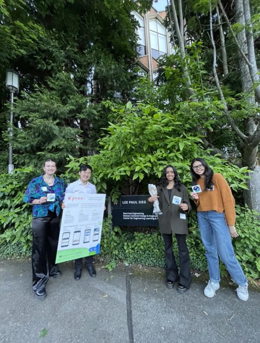
Once we implemented these changes, my team was ready to present our final product with an accompanying poster and video. All of these products represent a tireless and triumphant team effort to showcase our best work.
This six month capstone project was an incredibly rewarding experience. I am very grateful for both my team and our sponsor. Proxi was our top choice sponsor and working with them was a great learning opportunity. It was especially interesting to learn more about the start-up space and work in a high-impact environment. Even before the project wrapped up, Proxi began implementing some of the designs that we presented to them. For instance, one meeting, Melinda asked for our input in naming their new bookmark feature and we all agreed on the name “backpack.” To integrate Proxi’s branding into our project, we made an icon for this feature and reflected it in our own wireframes. Soon after, the backpack icon was implemented in their existing product. It was so gratifying to see this tangible impact on Proxi.
After Capstone, I was invited to work for Proxi to independently refine my team’s prototype.
This short-term design project involved working part-time from June 2022 - August 2022 to produce a simplified Version 0 of our initial Capstone Prototype. Responsibilities included: Updating user flows by removing features that Proxi could not support in V0, Building out missing pages of additional features, Aligning the design with Proxi’s brand identity, Soliciting feedback in regular meeting with stakeholders including the CEO, COO, and Director of Engineering, Presenting the final clickable prototype to Proxi stakeholders and iterating based on feedback.
My time with Proxi resulted in a refined mobile app prototype that the company intends to build and launch. My experience in an intimate start-up environment taught me to work efficiently and independently in order to produce quality work in a timely manner.


