Situating Code.org as the bold and engaging organization that it is.
In order to showcase the visual design skills that we developed throughout the quarter, my HCDE 308 peers and I were prompted to propose a fictional rebrand of a non-profit organization for our final assignment. I was assigned to Code.org- a well known organization that offers free computer science education in an effort to reach young women and other underserved communities across the globe. After researching their brand, I was surprised to find a disconnect between their branding and their mission. The following visual system represents my attempt at bridging this gap.
re-design Code.org in a bold, engaging, & universal manner to better reflect their organizational values and user needs?
Bold
Branding that reflects the bold nature
of the mission.
Universal
Reflecting all stakeholders engaging with the solution.
Engaging
Ensuring user retention for Code.org’s more mature audience.
Beyond their rules regarding Brand Assets Usage, Code.org does not indicate any brand guidelines on their website. Given the reach of their organization and the importance of visual identity in engaging an audience, it was surprising to observe a lack of clarity allotted to their branding. The below screen captures are representative of the organization's website at the time of this assignment.
Based on the imagery and color scheme, Code.org's current visual identity seems to cater primarily towards the younger half of their K-12 audience.
In considering the audience for my own visual system, I identified the various stakeholders who interact with the website to include parents, teachers, and industry sponsors- all of whom constitute an older demographic. This realization begged the following questions:
Does Code.org neglect a majority of their audience by catering to only a fraction of their user group?
How, then, could I develop a visual identity that reaches an audience of parents aiding their younger children and high school students navigating the website independently?
Could a more modern and mature rebrand elevate Code.org's current user experience into something that better aligns with their mission of accessibility?
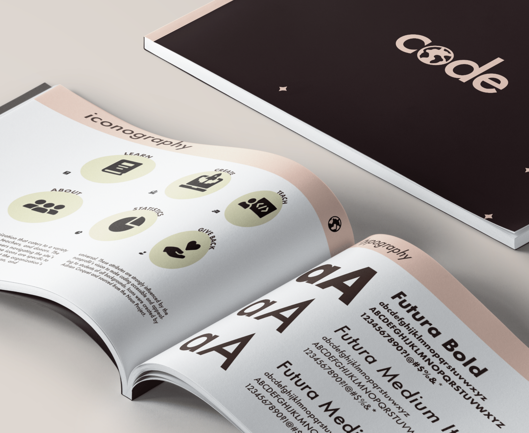
My final brand book includes more insight into the specific designs and decisions that I made in response to my primary research question. Flip through a digital copy of my rebranded visual system below! Logo created in Adobe Illustrator and brank book created in Adobe InDesign.


